Finding UX in the Trash
The point of UX is making things effortless #
I usually resist sharing at large my opinions on how to make software, out of some impostor syndrome nonsense modesty thing. But this was too much fun not to write it up and share with you all.
User experience is key to the success of any software product today. Yet I find that too many folks in our industry do not really understand what UX truly is. Let’s set aside software for a minute, and illustrate this with an example from a lofty place.
Trash Talk #

This trash bin was clearly designed by a well-meaning engineer. It accounts for every possibility… and it makes you play 10 questions every time you approach it. Are the forks compostable? Yes, turns out they are in this building. As in all cases where UX is involved, the point is not that saving the environment (or getting your network settings right) is not worth the effort. The point of UX is making those worthy aims effortless.
There are even icons of cans in both of the first two bins, which makes me twitch every time I approach to throw away a Coke. Of course all cans in the 21st century are made of aluminum, as Duck Dodgers would brashly point out. But in case you have found a tin can wrapped around your soup, it goes into a different bin. It’s in the sign, so what’s the problem?
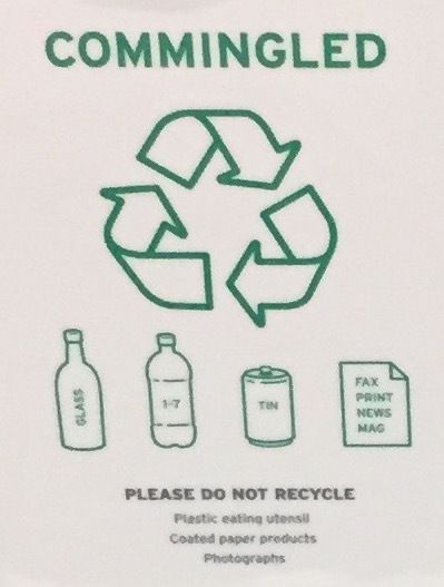
Fax (really?), prints, newspapers and magazines go into bin #2. But not photographs or coated paper products which, not by direction but by exclusion, go into bin #4. ugh.
Just like interaction with any phone app or modern website, throwing trash is an instinctive and quick motion. Do not make me think. But folks who do not get UX really do not see this point – and usually they are persistent types. Clearly, you do not understand how this trash business works, so let us ‘splain what goes into every bin one more time, now with pictures!
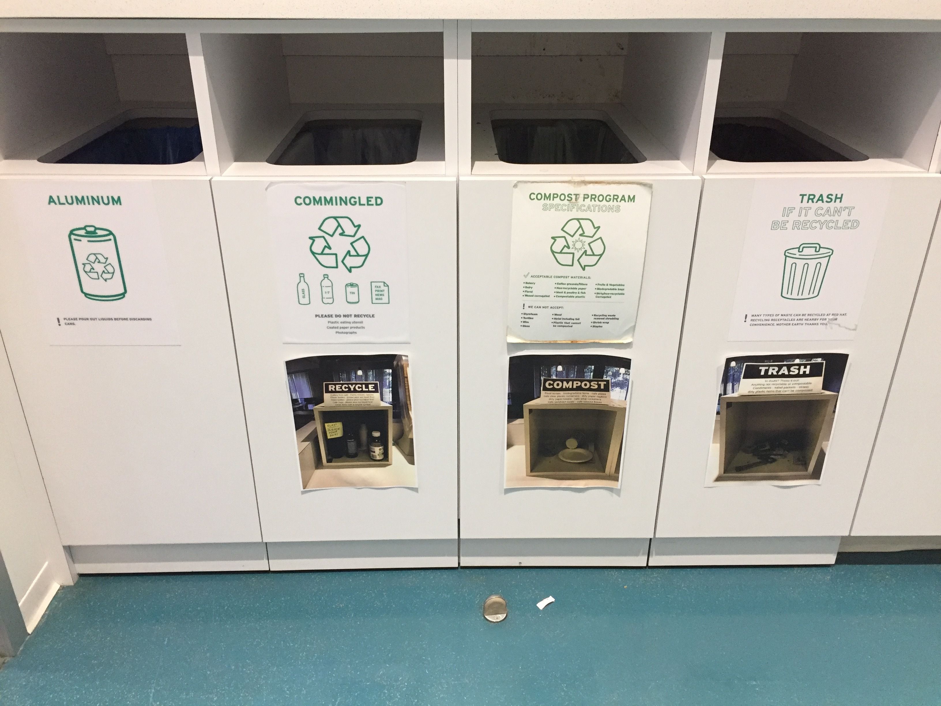
Folks were not reading the 4 pages of documentation for the trash bin. Cleverly, the thinking here is that 7 pages will solve the problem for us. Unlikely. But adding Documentation is not UX. Documentation is good, just like saving the environment is. But neither are UX. And if you won’t take my word for it, take it from someone who is managing the bazillion StackOverflow users:
TL;DR: Documentation should *supplement* intuitive design, never replace it. Documentation is not a substitute for expected behavior.
— Nick Craver (@Nick_Craver) August 27, 2017
This is even more important with recycling, where UX is about more than “just” saving people time, as users defeated by bad UX become non-compliant and will throw the trash into any bin. UX is turning those four bins into two (or one!) and signing up with a single stream recycling vendor. UX is taking options away while making the right thing happen somehow.
Now, let’s stop playing with the trash – it is fun, but not what we want to rectify. Let’s go back to software. You are on your home network. Should the printer at work, with no IP route to it, be the choice offered when I go Ctrl-P just because it was the one last I used?
Windows selects the last printer used. No big deal right? Just a pull-down away to change it. OS X has now for decades chosen to use the information that the IP address of my printer brings to offer a local printer, whenever it can distinguish what is local based on subnet changes.
The first is an engineered experience. The second is a designed experience. Highly usable design has become table stakes in the mobile space and from there it is influencing how people see software everywhere else. UX is eating software.
Rules for Revolutionaries #
Three rules to get you started. There are more, but… let’s apply some UX to this blog as well.
1. Making things simple is about taking options away #
Apple products do not leave around hundreds of exposed settings for that one user that wants to fiddle with each of them. Apple aggressively takes options away whenever possible, but if they only did that they would be failing in the market, not heralded as a paragon of design and usability with 1.2 billion iPhone users out there. John Maeda put it best:
“Simplicity is about subtracting the obvious and adding the meaningful.” #
Apple makes the right thing happen automagically in its products, without you having to do anything. Maybe you lose 100 knobs to turn, but to most people, that one button on the iPhone and the clever choices the software makes for you are a way better design than the “bucket of bolts” alternative could ever be.
The best designers I worked with call this having an opinionated product. You have a clear, consistent point of view, and automation hidden behind the scenes making all the right choices using this point of view.
2. Design the whole, not just the parts #
Instead of focusing on enabling every little corner case with an additional setting, Apple has succeeded by ensuring that from the time the user visits the Apple Store to the time a product is retired, every step of the way is accounted for, planned, and even choreographed.
“we guide every interaction,” and “enrich their lives” pitted against adding a toggle to enable jumbo frames in your layer 2. Think about that.
3. No shortcuts #
Making things simple is actually one of the hardest tasks you can ever be assigned. It always involves making choices, a currency in short supply in corporate organizations. Choices that will definitely disappoint a few users to (hopefully) the eventual delight of all others. It involves lots of effort, because it is typically disruptive to your existing code base and cuts right across established processes. And this disruption does not come to add a marketable feature, either – it does not suck any more is not a message your PR team can use. On the other hand, when a product in your category delivers good UX, all competitors suddenly feel irrevocably out of date. Not bad as competitive advantages go, don’t you think?
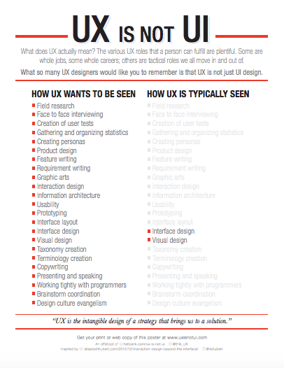
All too often, folks who do not 'get’ UX take an easy way out. One that drives me bonkers is “we need to make it easy, lets put a user interface on it”. Repeat with me. UX is not UI. UX is perfecting the intangibles in the design of the path that takes the user to a solution. Even better, after you achieve enlightenment, print a copy of Erik Flowers’ poster and place it somewhere people can see it and reflect upon its deep wisdom.
A State of Mind #
We have expanded a lot on what UX is not, which is fitting for a fleeting property that is achieved by taking things away. As experts in our field, we do not see these things as cruft, we see them as natural properties of a system we understand. The trick is to step out of your own skin to realize that the typical mobile phone user does not need to know about things like IP subnets, as long as we can put the right setting in place automatically. When Mark Shuttleworth led the Ubuntu PM team at Canonical, he would call this switching from the UNIX Experience to the Apple Experience, which is also a handy way to remember that we can usually leave the expert options in a separate CLI without crowding the graphical user experience.
Some folks, upon reading the trash example, write it off as a ‘first world problem’, for surely you can spare a couple of seconds to put the trash in the right bin. It even makes you feel like you are part of a greater cause. Yes, indeed you could also select the right printer, albeit without experiencing that cathartic moment. Great UX is about saving those few seconds again and again – in the trash case they do not add up as dramatically, but in software, you can shave a few seconds (sometimes even a few minutes) in almost every task, and the compound results are dramatic: people feel the difference, they do not even have to analyze or account for it.
Look for inconsistency. Look for for externalities. Most of all look for annoyances. Usability is not having 10-digit conference access codes with 5 second timeouts. Usability is about making a big difference by fixing a lot of little things that eat into a user or a team’s productivity and enjoyment of your product. Do it again and again, and your product will be a creature of a different world. And that is definitely worth all the effort.
Comments? Discuss on Hacker News.
UPDATE:
We made it to #4 in Hacker News’ list.
Interesting debate in the comments, with half of readers focusing on actual trash UX as opposed to the software problems I am writing about. They shared interesting facts about the current limits of single stream processing, and efforts to advance existing mechanical sorting approaches through the use of machine learning.
Bored Elon also commented on this topic—and of course, he is also focusing on the trash, not on software UX. Oh well.
Public trash bins that sort the damn garbage for you instead of judging you.
— Bored Elon Musk (@BoredElonMusk) January 12, 2018
Seth Godin has also weighed in on the UX topic with this insightful daily blog: